Agartha
A bootcamp made to take you on a journey from an absolute beginner to an advanced project manager professional.

A bootcamp made to take you on a journey from an absolute beginner to an advanced project manager professional.

Year
2021
Role
Graphic Designer
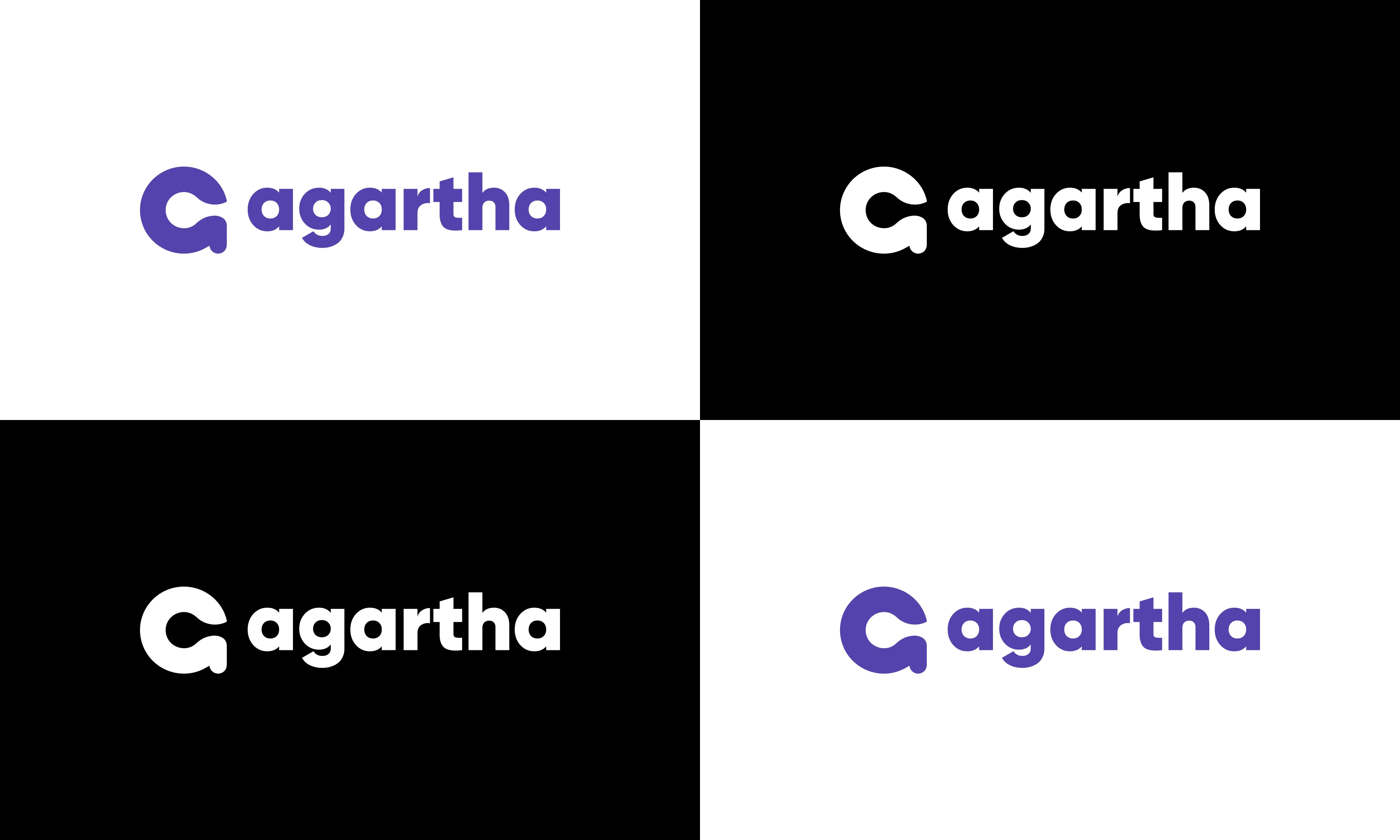
Agartha is a bootcamp based in Medellín, Colombia and is made to take you on a journey from an absolute beginner to an advanced project manager professional. We were startup and started to design the logo and website to consolidate the brand identity. I was responsible for the logo design.

It all started when my partner (Santi) and I wanted to build a bootcamp for those who wants to learn project management. It was a pandemic and people's communication was virtual. We wanted to start the bootcamp virtual, so we started scouting talents and professional people from different countries and our proposal to set up a bootcamp was approved.
Agartha is not designed to be just a bootcamp only. It is also designed to be a community for students to build networking (or connection) and to share information. It operates in a social network format with elements of a web forum and supports an electronic voting system for liked messages. What Santi wants is not only to accept students in America but all over the world from different countries. I proposed the name of the bootcamp to be Agartha (According to Google, Agartha is a legendary kingdom that is said to be located on the inner surface of the Earth. It is sometimes related to the belief in a hollow Earth and is a popular subject in esotericism.) Since the students will come from different countries, the Agartha bootcamp will be the inner surface. Interestingly, the logo is designed of an alien; you will notice the shape of an alien looking out from the window at midnight when you rotate the logo by -90%.
The logo is meant to symbolized intelligence, progress, movement, consistency, and agile, evoking both a timeless and futuristic vibe.

I used the modern sans serif with a geometric touch font Gilroy; sans serif fonts gives the design a modern touch. It also brings a lot of clarity and usability. Simplicity as its best. This font is simple and open and has just enough character on the ligatures to keep it interesting.
Gilroy
Aa
ABCDEFGHIJKLMNOPQRSTUVWXYZ
abcdefghijklmnopqrstuvwxyz
The brand logo's color palette tells a compelling story – from the creative flair of purple blue, to the timeless elegance of black, and the pristine transparency of white; these hues intricately weave together, embodying our brand's essence of innovation, creativity, sophistication, and clarity. This logo is a vivid reflection of who we are.
01
Royal Purple
HEX
#5443AE
RGB
84 | 67 | 174
CMYK
52 | 61 | 0 | 32
02
Black
HEX
#000000
RGB
0 | 0 | 0
CMYK
60 | 40 | 40 | 100
03
White
HEX
#FFFFFF
RGB
255 | 255 | 255
CMYK
0 | 0 | 0 | 0
Looking back at this project, I boosted my confidence and honed my communication skills with my teammates from different countries. It was great collaborating with Santiago Londoño Díaz, a senior product owner and project manager at Globant, who led the team and mentored me. I'm proud of our team's accomplishments despite the short period of time.
This project provided an excellent platform for me to acquire new skills and refine my analytical expertise through user research. It showed me that a successful brand is not just about creating a logo or tagline; it's about understanding and connecting with customers on a deeper level. This showed me how attention to the smallest details is important with the branding.